hidden

Integrate the regularly-used systems for forecasters to deal with daily tasks

  • Goal

    Integrate five systems in the Taiwan Climate section, which is the most-used part of the CMF, into a more functional and efficient system.

    Challenge

    How to balance both the user and developer sides by dealing with more than fifty different formats and data sources?

  • My Roles

    UI/UX Design

    Team:

    1 product managers, 2 frontend developers, 2 backend developers

  • Mining usage insights and summarizing a suitable solution

    I initially selected several commonly-used systems from a hundred systems in the CMF, then conducted a focus group with several forecasters to confirm the actual needs. After conducting in-depth interviews, I dug out the most common approach they used while dealing with their routine reports: The users tend to spot the phenomenon on the graphs, confirm precise data in tables, and look up other graph types for details.


    INSIGHT

    I always believe in evidence-based design and persue value-oriented products, but my marketing background adds a bit different to my design plans.
    UX researchers and marketing strategists work similarly in process and methodology but slightly different. Strategists will set up the likely hypothesis based mainly on the quantitative study while the UX research verifies the ideas repeatedly based on qualitative research.
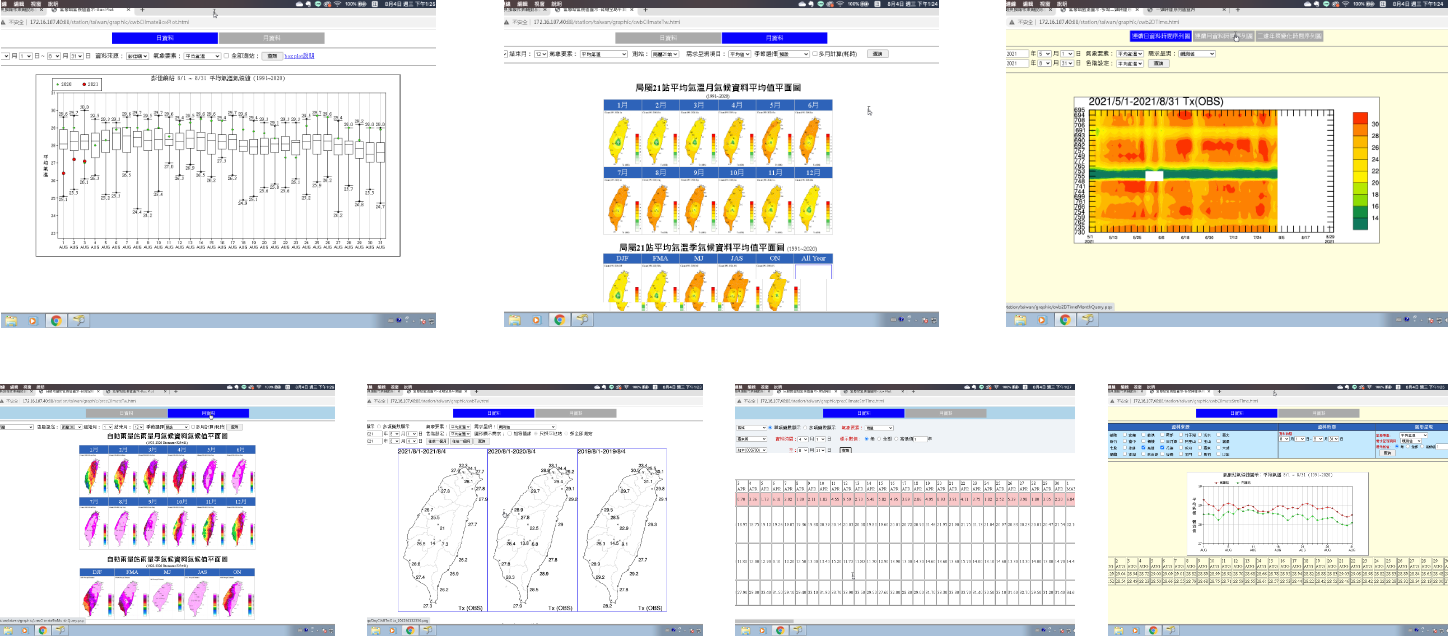

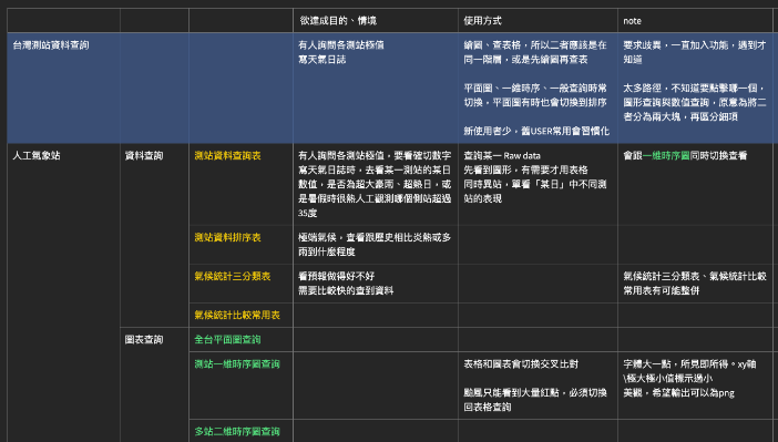
    The system I initially selected from the CMF.
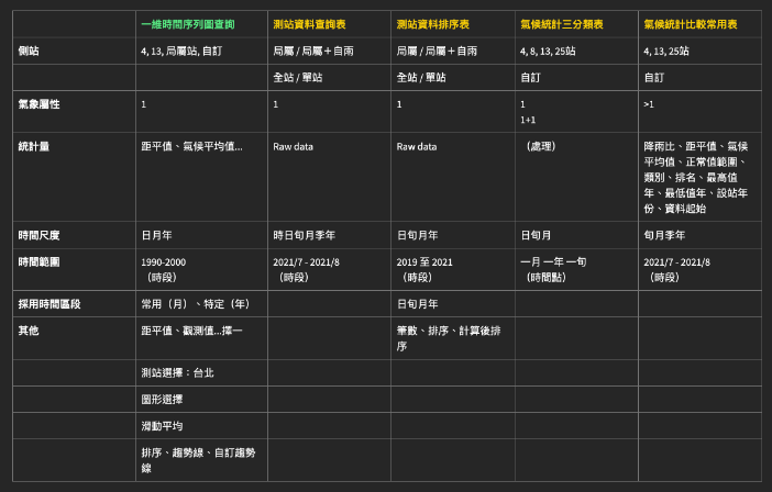
    CHALLENGE- Resolve tangled data sources and systemize them into a reasonable flow

    My second task was to overcome the various data sources, which became the most challenging task I have ever met. In this case, taking engineering as the second priority is inevitable, especially in a heavy data-based product. I was pretty frustrated at first since I was the only designer here. Without any partner, I tried to ask for helps from the social communities.

    Thankfully, I listed and compared all the data sources and made the final decision successfully in the end. My front-end technique also improved while discussing the feasibility with engineers back and forth.

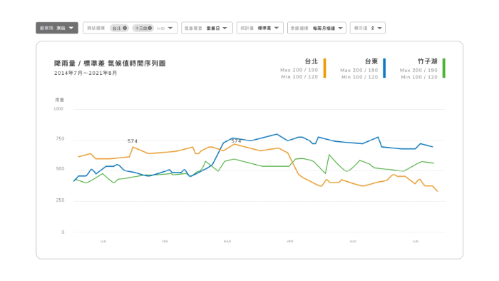
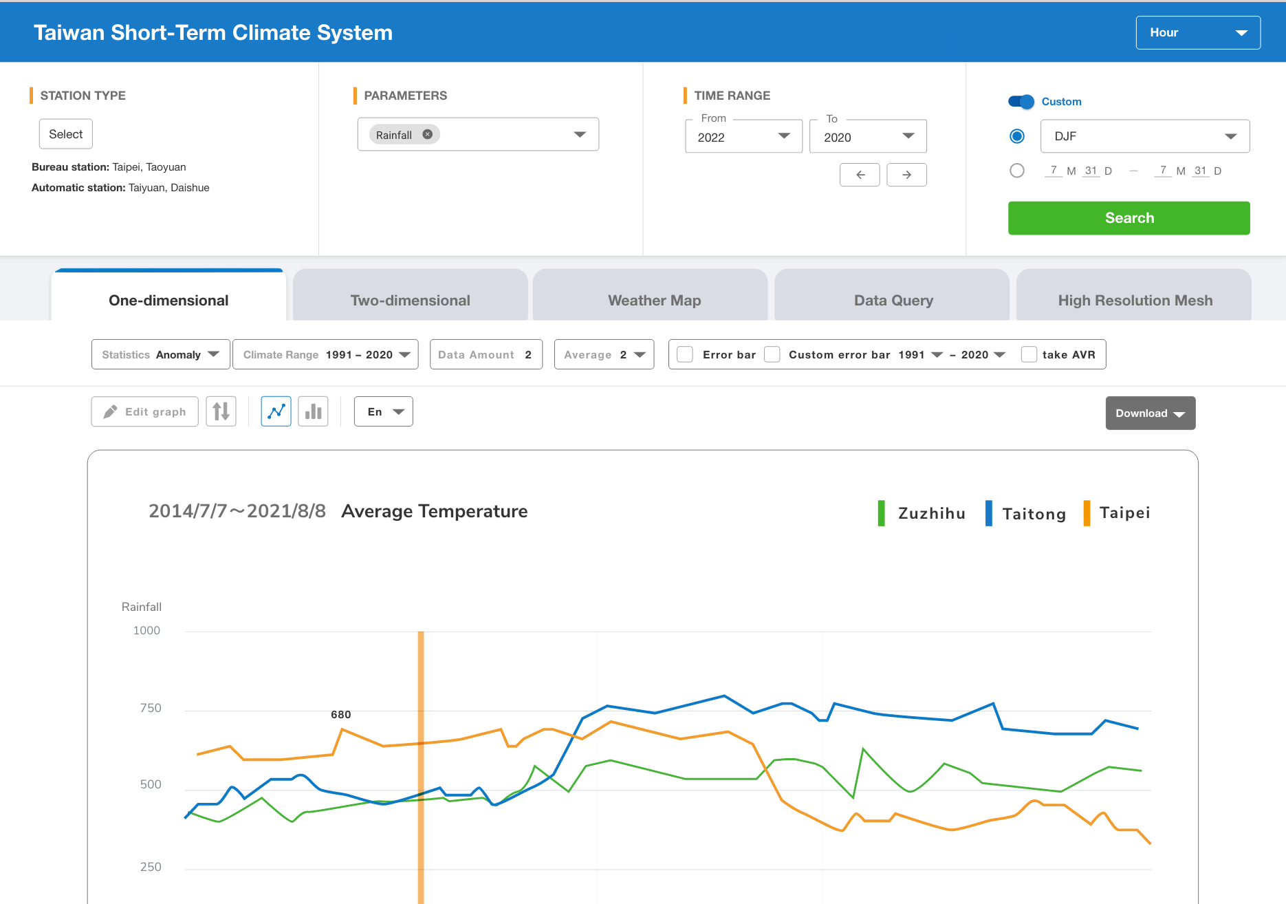
    Refer to the original order to distinguish the query menu

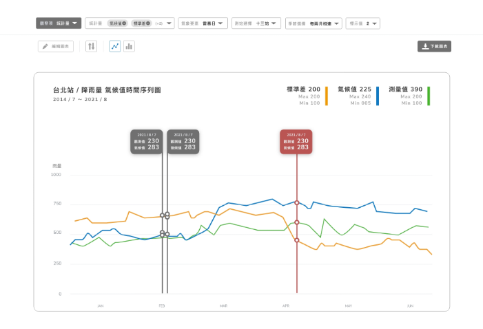
    Usage patterns in the system are often repetitive, so every click is important. I made multiple adjustments according to the user's pain points, minimized per click on every action, and optimized the hierarchy of settings and inputs.

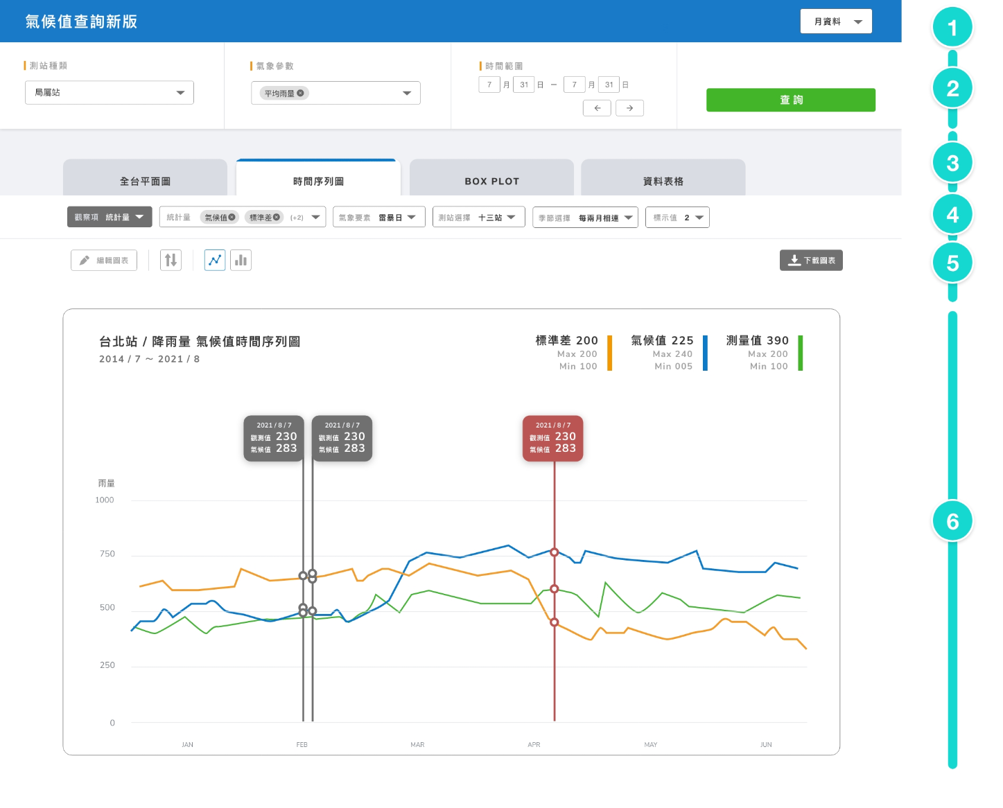
    1. Topbar is for the timescale set.
    2. The main menu sets the essential searching attributes like location, statistics, and period.
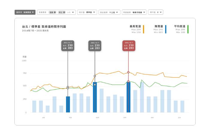
    3. Tabs decide the form of graphs, and user can easily switch over them.
    4. Sub-menu is for setting the details of the specific attribute.
    5. The customized menu includes style setting and download.
    6. As for the graph area, I carefully ensured the correctness of the final product with developers and clients.

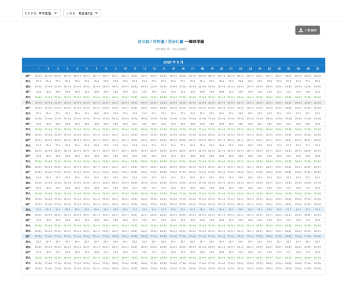
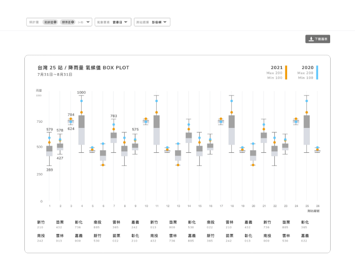
    Adding value to informative charts by well-designed data

    Unlike the charts with rigid style before, users now can customize attributes to fit the charts in their presentation. Despite all above, I'm also looking forward to adding extra value to the product by presenting the specific metrics in a readable and delightful way. Apart from minor data issues, most forecasters were very surprised by the smoothly-use feeling and gave us positive feedbacks.