The Shift to Digital: Moving Away from Paper-Based Operations
In the 2022-2026 timeframe, the Civil Aviation Administration (CAA) underwent a large-scale internal systems overhaul, including a key project to integrate the Model Display and JMDS Forecasting Systems and convert them into web-based applications.
As the lead designer for the forecasting system, I worked with a team of 11 engineers and 2 project managers. Within a 4-month sprint, we conducted 7 user interviews, 4 product iterations, and over 10 remote and in-person user testing sessions. Participants included the Director, Deputy Director, and Technical Director, as well as 12 managers from the meteorological center and over 60 forecasters from around the country. By closely collaborating with stakeholders and conducting thorough user testing, we were able to design a system that met the needs of our users and improved their experience.

Goal: Integrating Model Display and JMDS for Improved Forecasting
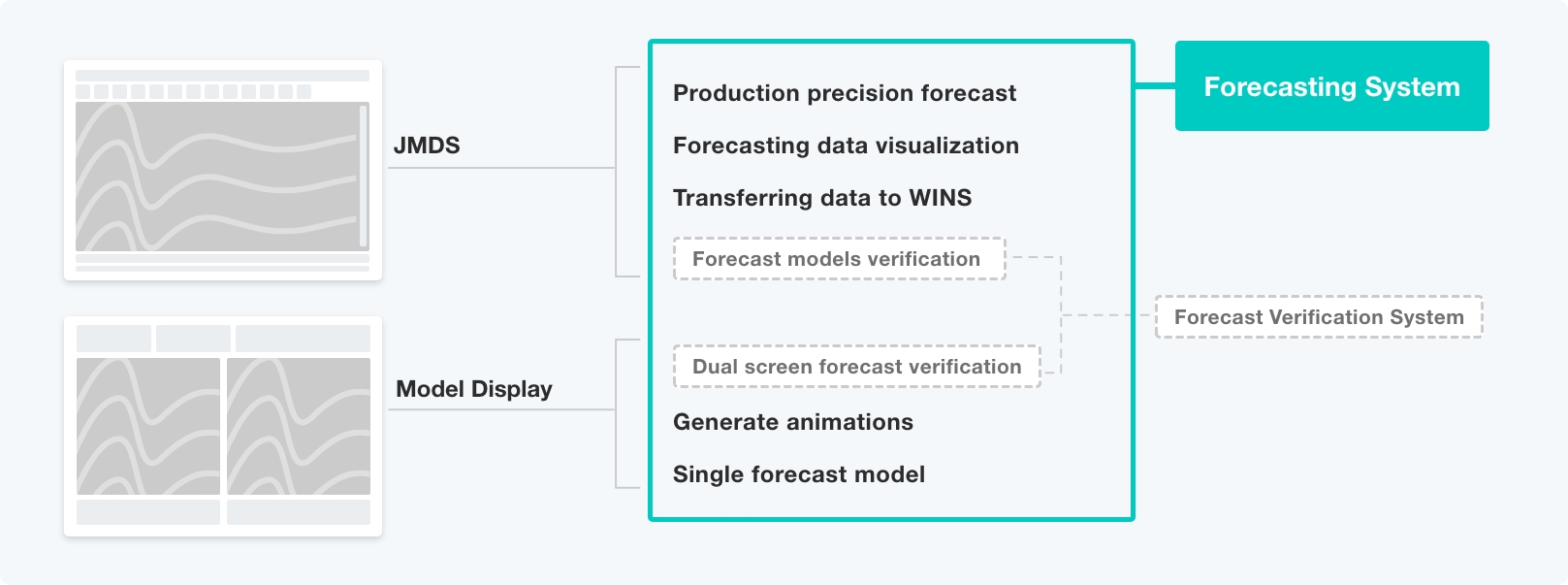
For this new UX project, the first step was to thoroughly understand the needs and perspectives of our users. Through research, I discovered that the Model Display and JMDS systems had significant overlap in functions and data sources. While JMDS was primarily a data visualization system used for querying and sending data, Model Display focused on verifying past forecasts through precise calculations and animations.
Given the available data sources, I decided to integrate Model Display and JMDS into a new forecasting system and also build a verification system. By considering the unique strengths and capabilities of each system, we were able to create a more comprehensive and effective solution for our users.
A Different Approach: Designing for Internal Users
There are significant differences between planning an information-intensive system for internal use and a public product for customers. System users have more specific goals and focus on a flexible but clear information architecture, including whether it can be effectively understood by users and easily expanded in the future. Designing for internal systems can be a complex and nuanced process, and it's important to carefully consider the unique needs and requirements of the users. This presented my first dilemma: Design Thinking was not applicable to this project, and I couldn't find guidance online.
Challenges and Solutions: Designing for Immersive Forecasting
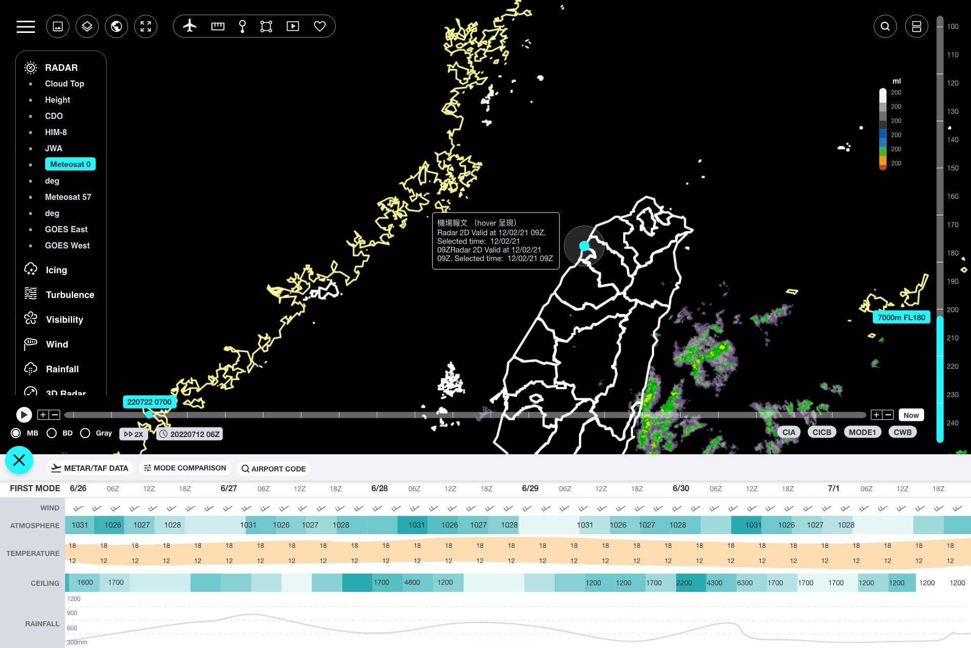
Based on feedback from forecasters after the first round of interviews, I developed a basic layout for the web-based system. I maximized the most important graph area by making it full screen, zoomed the timeline and height axis as much as possible, and combined the navbar and toolbar into a single column. These design decisions were made to prioritize the key information and enhance the usability of the system for the users.

Navigation: Improve the flow and hierarchy of the menu
1. Improve the user flow during navigate
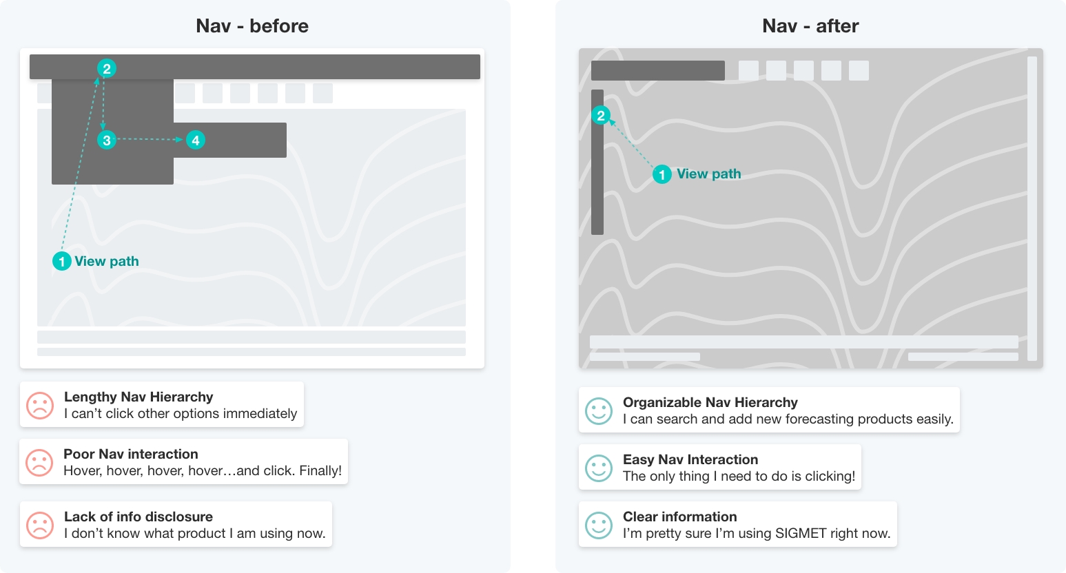
After conducting two more interviews, I found that the navigation bar received over 100 clicks per day, but about 80% of users complained about the cumbersome process. They had to click through three times to display or toggle the navigation items. To address this issue, I adopted the following strategies:
- Positioned the navbar as fixed
- Expanded the options on the right
- Reduced the number of clicks on sub-items
- Made the interaction easier
By implementing these changes, we were able to improve the usability of the navigation system and enhance the user experience.
2. Reorganized of Information Hierarchy
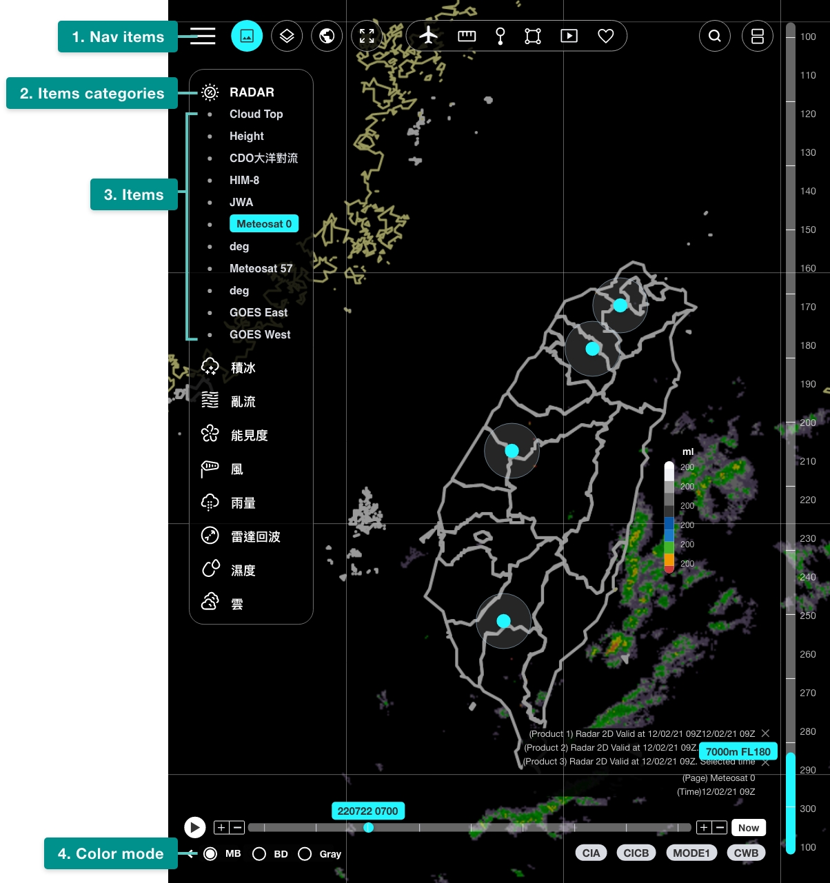
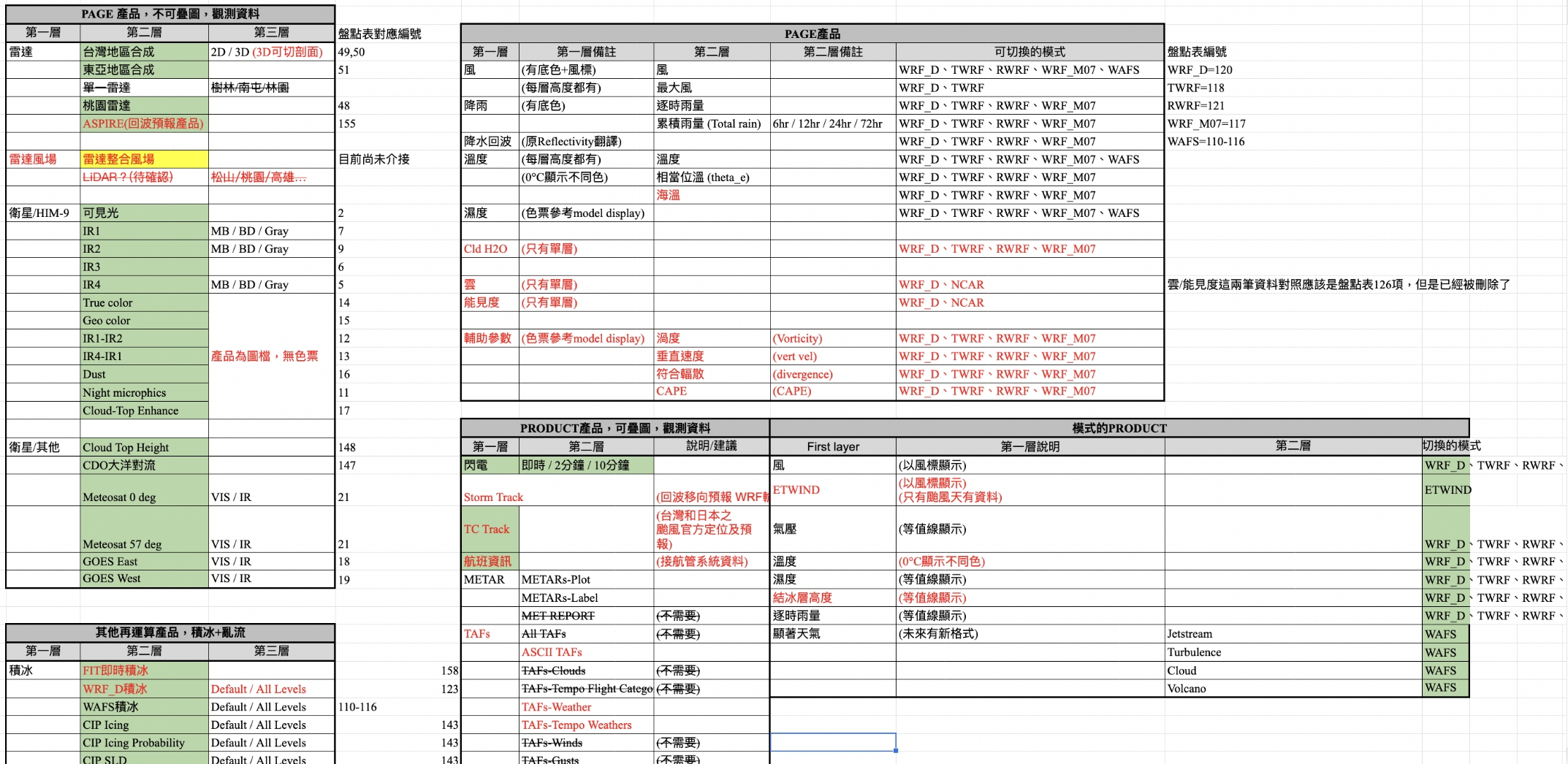
In addition to improving the flow, I also reorganized the information hierarchy of over 100 products and view options. The first level was the nav-items, the second level was the item category, the third level was the clickable item options, and the fourth level was the color level setting. Users often follow the timeline when switching colors, so I placed the color-setting below the timeline, which was well-received by users. By carefully considering the needs and preferences of our users and organizing the information in a logical and intuitive way, we were able to improve the overall user experience.
Note. I organized the products in the excel.
3. Adjust the design according to the usage frequency
After conducting a five-hour user observation, I found that the nav items were used unevenly. For example, users clicked on PRODUCT more than 50 times, but only adjusted MAP and DOMAIN a few times. According to the forecasters, PRODUCT and VIEWS were switched over a hundred times, while the other items were rarely adjusted.
Improving Usability of Complex Content in the Toolbar
When I first started the project, I was overwhelmed by the sheer amount of content and didn't know where to begin. After seeking guidance from the UX group, I decided to approach the content strategy from both the user and content perspective.
Refine and integrate important features
In order to address the forecasters' concerns about the current toolbar, I focused on improving the integration of charts and data. I also identified and removed unnecessary functions to streamline the tool. By refining the functions and improving the overall organization of the content, we were able to create a more intuitive and user-friendly experience.

Create Findable, Scalable and Clear Diagrams in Weather Timing Diagrams
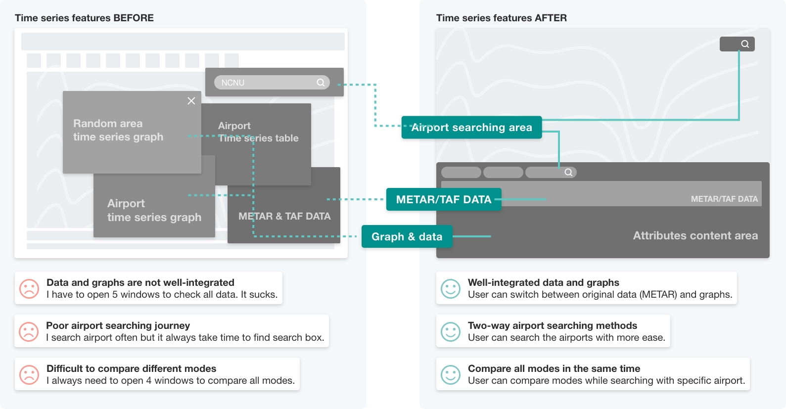
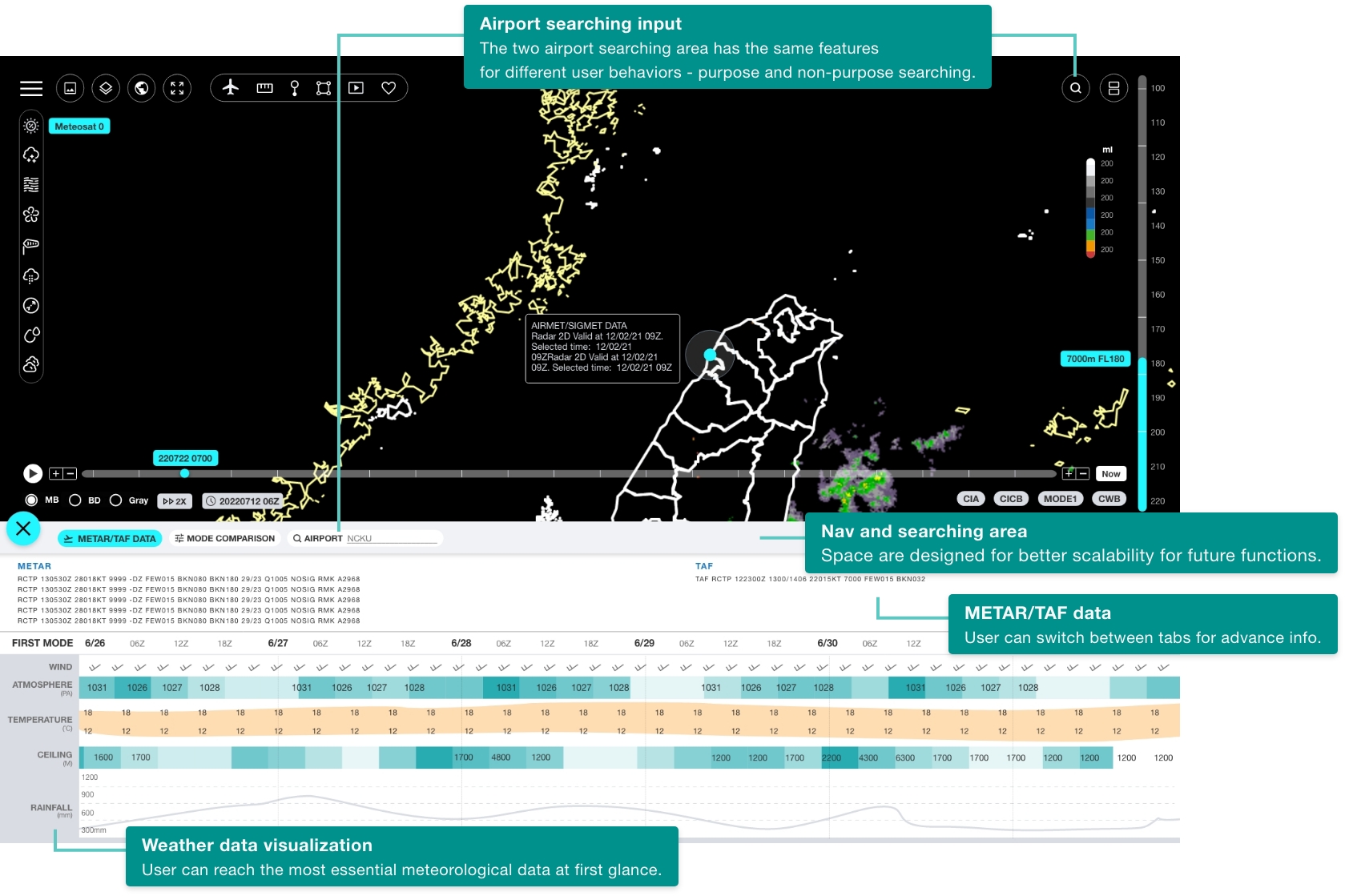
The weather timing diagram is a critical tool, so it is important to ensure that it is easy to find and use. Forecasters frequently use timing diagrams to view and compare meteorological parameters with different forecasting models. To make it easier for users to find the information they need, I added an airport search box to both the outer interface and the diagram area. This allows users to quickly and easily search for specific airports and improving the findability and usability.
After several user meeting, here is final mockup handed into the engineers.
My final design
*Please click it if it's not playing.
Domain knowledge in information-intensive projects
I definitely said the domain knowledge is the most
struggling part in the information-intensive system. Here is how
I understand them.
For example, the Civil Aeronautics Administration (CAA) needs a
timeline function that allows users to compare the same time
across different RUNs and products. The initial time, RUN, and
ending time are all important considerations for this function.
- The first time of each model forecast.
- Initial time is often changed, typically located in the setting or timeline.
- When the initial time is changed, the product/page should also be changed.
- Example: if the forecast field starts at 8:00am on 5/25, the forecast range will be from 5/25 8:00am to 6/2 8:00am.
- There is one RUN every 6 hours, resulting in 4 RUNs per day.
- A RUN is a forecast for the next 7 days, and each produces a slightly different forecast.
- If the user selects a RUN, they can only choose from the corresponding forecast products and time range within those 7 days.
- The ending time is the last time of a RUN.
- Whenever the user sets the RUN, the ending time will change.
- RUN and ending time do not conflict with each other.
- The user cannot select an ending time that exceeds the current RUN.
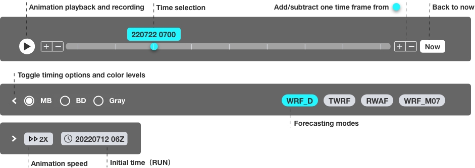
Using the "Situation, Requirement, Approach" Method for Clarifying Complex Functional Requirements.
For larger functional requirements, I will write "situation,
requirement, approach" to clarify the problem. Taking the
timeline as an example:
Situation: The current forecasting system only
displays data from the latest RUN, which may be incomplete or
inaccurate. Users need to switch to previous RUNs to verify
the data.
Requirements: The ability to capture and compare all
RUNs in the database.
Approach:
- Users can compare the same product with different initial times using dual windows.
- For example, a user can set 10/25 00Z on the left window and 10/26 00Z on the right window, and then switch between products for comparison.
- By default, the system only displays the latest 3 RUNs. If a user needs to access previous data, they can click "+more" at the bottom of the RUN options to expand the selection. Overlapping initial forecasting fields are not considered.
Non-Interface Design Challenges: The Importance of Research Skills
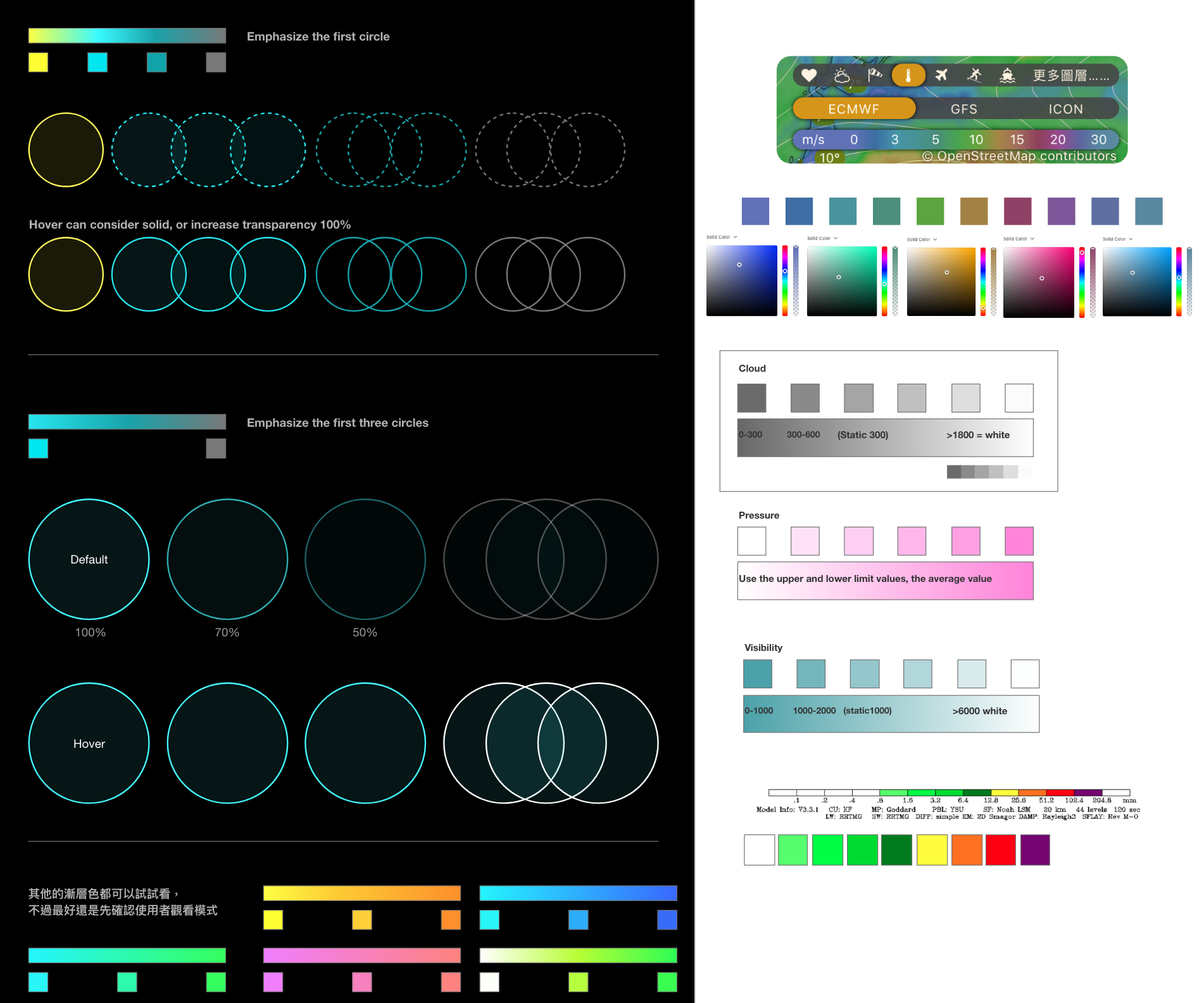
Improving my research skills can be a valuable asset in any field, and non-interface design is no exception, for example: the confusing color bar of products. To improve the accuracy of data visualization, I tried several approaches, including conduct additional user research, consult with fellow experts, experiment with different visualization techniques and continuously gather feedback from users and iterate on the visualizations based on their feedback.
Overall, I believe that design that is based on research and evidence, is essential for creating a successful product. By following an evidential design process, I can ensure that our designs are grounded in the needs and behaviors of our users, leading to more intuitive, effective, and user-friendly products.
