hidden

Redesign the official website of the India Meteorological Department

  • role

    UI/UX Design (side project)

  • Background and limitations

    Working as a UX designer in CWB, I enjoy researching official websites of the Meteorological Bureau worldwide, so I took IMD as a redesign side project. The overall design has shortages, like unclear IA structure, overwhelming colors, and unreadable graphs. I decided to enhance the usability and the user experience of the front page but kept the same information amount.


    What should I do if I can't access to users?

    Reaching a compromise with anyone is extremely important and challenging. During my UX career, one of the biggest problems I often encountered at work was that: the clients insisted on keeping some redundant functions or pages for no reason as they consider using them in the future. Therefore, I tended to adjust the visual hierarchy to hide the functions shown to be unnecessary in the product.

    It is almost impossible to reach the target users -Indian or tourists, in a short time, and not to mention collecting the surveys or getting any interviewees for focus group research. After interviewing some staff working in the CWB, I analyzed and summarized the essential elements of the sites of seven different countries.Interestingly, the website layout of Australia and India are highly consistent, so illustrating the differences by comparing them is a simple way to see the current problems.
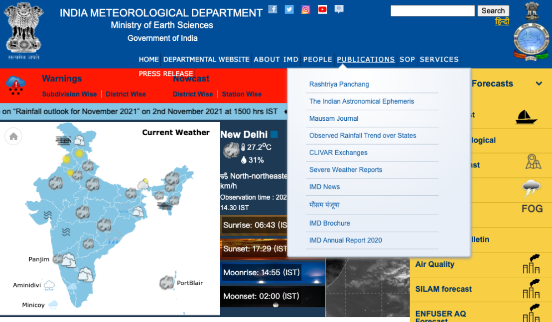
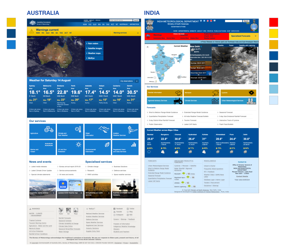
    The current problems of IMD

    Unclear information hierarchy

    Though IMD offers an incredible amount of weather information, it is not easy for the public to gather information by a glimpse. For example, more than four geographical graphs are set in one block, while other countries only contain less than two.

    1. The IA structure in the navigation is confusing
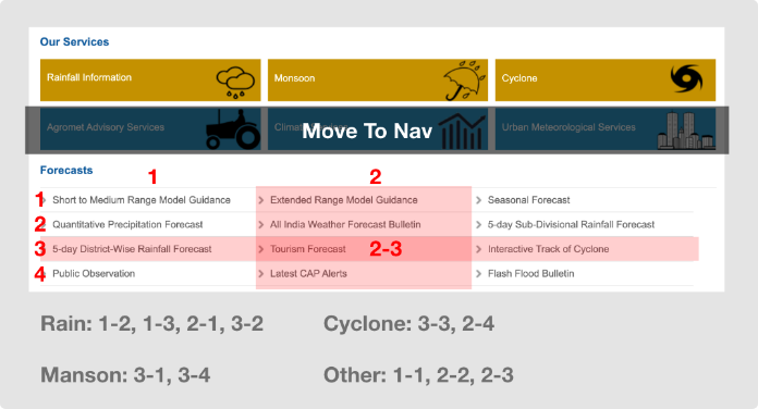
      The nav information is not well-categorized in the IMD, and the same nav items appeared in both the primary and secondary navigation bar.
    2. Some contents keep repeating in several blocks.
      For example, the forecast information appears three times on the page: the forecast block, footer, and sidebar. Too many parallel links can easily confuse users according to information architecture rules.

    Improper visual class arrangement

    1. Overwhelming colors. The number of colors in the IMD doubles compared to Australia's site. When applying more colors to the interface, the user must spend more time distinguishing them, increasing reading difficulties.
    2. Insufficient spacing. The IMD has compact layouts without proper spacing and content. Hence the users may find it suffocating to read.
    3. Unhighlighted critical message. The font size of the headline is not much different from the paragraphs, which lowers the readability.

    Information architecture and dirty prototype

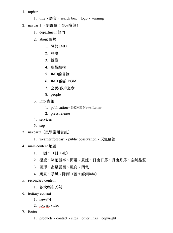
    Before proceeding with the design, I usually use note-taking software, like Evernote, to organize the structure for providing a rough guide to the prototyping sketches.

    The fin sidebar prototype

    Nav IA redesign

    The original content is not classified, including services and forecast systems, so users may confront obstacles understanding the functions just by titles. I designed four tabs with descriptions for users to get the rough ideas before clicking. Then, I divided the navigation into two parts :


    1. The navbar has the most critical information, such as weather details in big cities, warnings, various forecasts, including walruses, haze, floods, lightning, and typhoons.

    2. The sidebar has some information least used, such as IMD, members, service details, annual reports, and PDF files.

    Prototyping

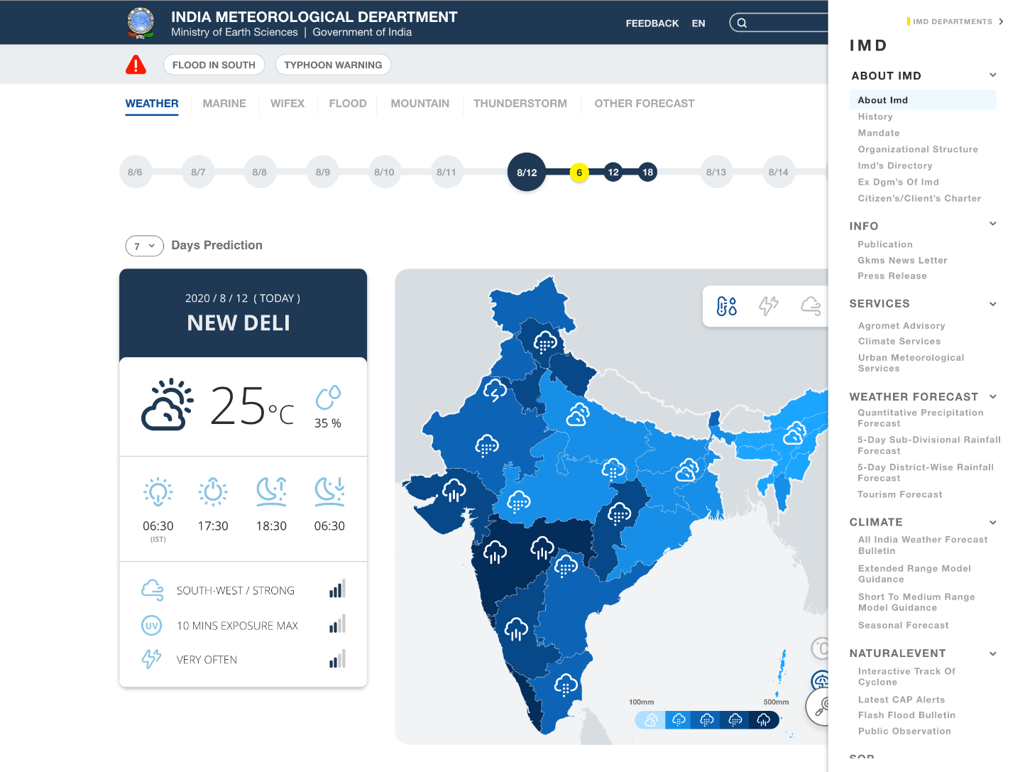
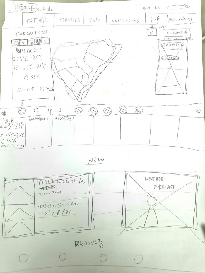
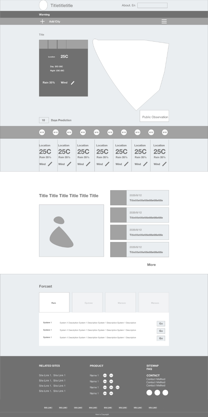
    Then, I worked on a paper prototype to confirm the layout of all information and struggled with various trade-offs in this process. Finally, I determined the detailed functions of each block and designed the visual part to complete the prototype.

    Dirty prototype

    Wireframe

    Color scheme

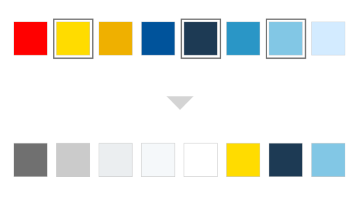
    I picked three colors from those in the IMD. Yellow text on the blue background is very suitable for the weather, as many technology companies use a similar color scheme.

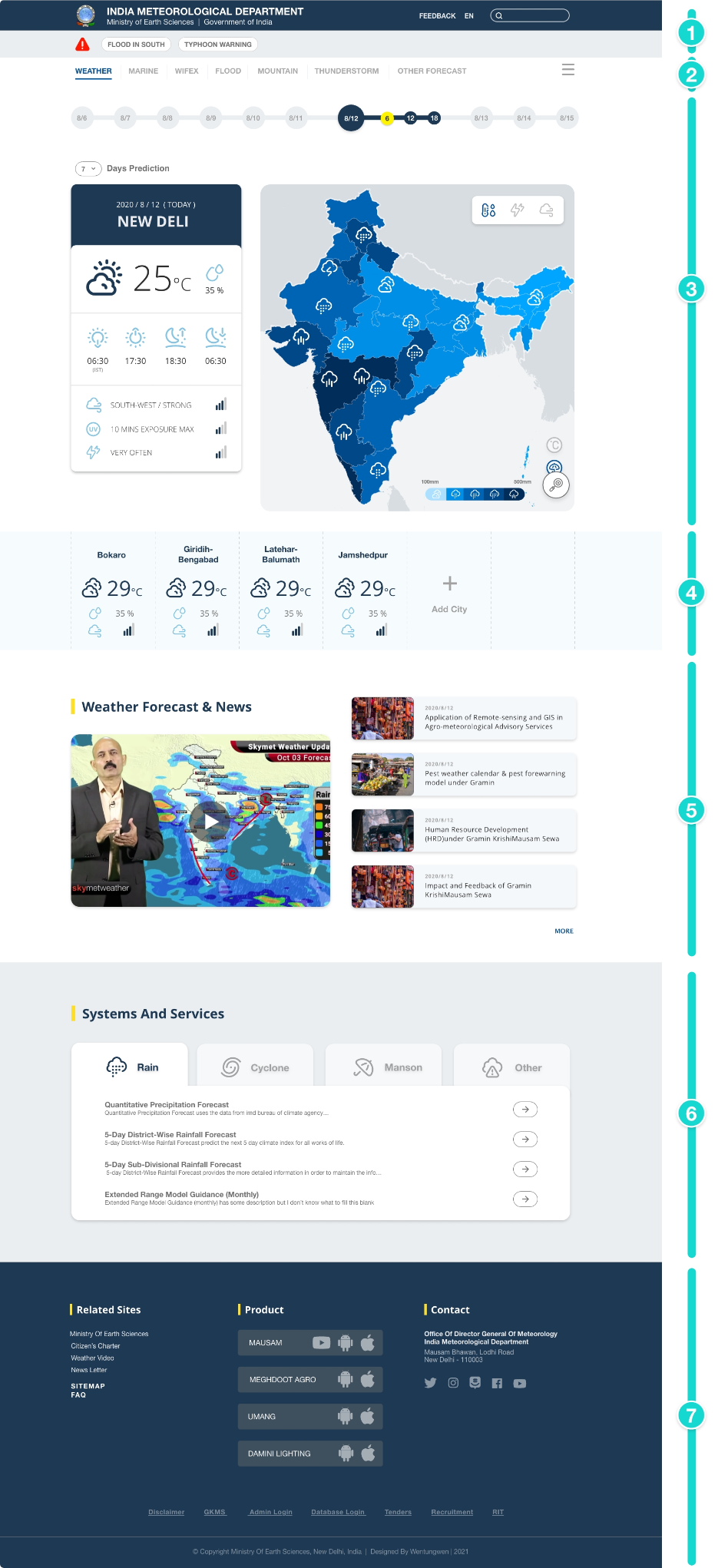
    1. Topbar
      Topbar should be as simple as possible, so I only left those related to personal information, such as about us, language, and search.
    2. Navbar and sidebar
      To separate the usage frequency, I divided the navbar info into two parts, the navbar, and the sidebar, to reduce the searching time.
    3. Main map + Seven-day forecast:
      The weather forecast will be a crucial component. The general users must view the weather details clearly with the outlined map, which is the most readable one; other maps were discarded, but users still can find out inside the information on the sidebar. Plus, I designed a timeline for a 7-days forecast.
    4. Big city forecast
      A new city function is set up to track the weather for frequent visitors.
    5. Weather forecast and news
      It is hard to find the latest news in the IMD, so I decided to add a block for information and current weather forecasts after observing the configuration of various countries.
    6. Cities forecasts
      Initially, all services are not correctly classified, and it is difficult for users to understand the functions in terms of words. I designed four tabs and added a short description to reduce the visual load.
    7. Footer
      Footer will include rarely used products and other links, including the four APP products of the Meteorological Bureau, contact methods, site map, and QA. Additional links are set at the bottom, like database login and logout and reference materials.